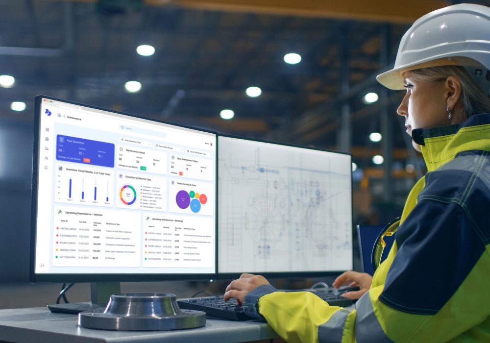
How we designed a simpler dashboard for busy fleet managers

Most fleet dashboards promise ‘insights’. Too many just deliver confusion. We’ve seen dashboards so bloated with charts and tables that even the smartest fleet manager ignores them after week one.
So when we designed ours, we made one rule: If it doesn’t help someone act today, it doesn’t belong.
Here’s what that means in practice:
One place for the big picture
Your key stats are front and center — fleet availability, open maintenance tasks, top costs, open issues. No more clicking through endless tabs.
One view for different roles
The CFO wants cost breakdowns. The operations manager wants usage and downtime. The technician wants to see which machines are due for service. Everyone sees what they need, without duplicate work.
Tasks, not just numbers
A good dashboard isn’t passive. It tells you what needs doing: ‘3 inspections overdue this week.’ ‘2 assets idle for 30+ days.’ ‘One machine due for replacement.’ Simple, direct, actionable.
Accessible anywhere
Managers in the office. Technicians on-site. Contractors on the move. Everyone works off the same real-time data — laptop, tablet or phone.
Built with real users
We didn’t build it in a vacuum. We spent weeks sitting next to fleet managers, rental coordinators and site supervisors. We ditched what confused them, doubled down on what they actually used.
The result? A dashboard that doesn’t just look nice. It helps you run a safer, leaner, more profitable fleet — without needing an extra hour in your day.
Related articles
Categories
Interested in optimizing your fleet management?
Not just tracking, but real fleet management.

